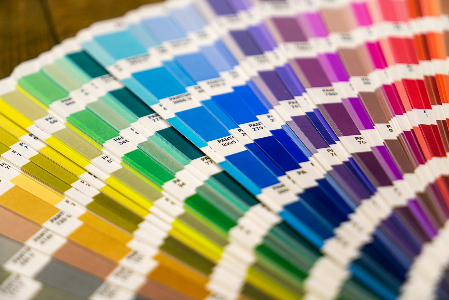
Lately, I have noticed some brands releasing new color constantly. Not at an understandable seasonal or limited-edition cadence, but at a persistent, weekly or semi-weekly pace. They are flooding their line and their customers with an endless stream of colorways.
This is not color strategy.
This is color immaturity at best.
At worse, it’s a fast way to devalue the brand.
Flawed Color Assumptions
In a competitive market, it’s not surprising why some brands might feel tempted to offer their products in countless colors. The thinking may be, “If we offer every color, we’ll appeal to everyone,” or “The more colors we offer, the bigger market share we’ll gain.”
This thinking equates more colors to more sales and more brand interest. But that is faulty logic. The number of colors offered in a product or by a brand is not directly proportional to sales or customer engagement. In fact, there is a tipping point where the size of a brand’s color offering loses its benefits and starts to work to the brand’s detriment.
The Problem with Overloading Color
When a brand bombards consumers with new colors, it signals a lack of strategy. Random and excessive color drops that are not rooted in a brand story or purpose, feel arbitrary, scattered, and eventually, desperate. Rather than helping to achieve the goal of gaining sales or interest, this chaotic approach leads to confusion, brand fatigue, and ultimately, the devaluation of the brand itself.
Trying to appeal to everyone can result in appealing to no one. It turns a brand from something purposeful and esteemed into something average. When consumers notice a brand continuously releasing additional colors, it gives them less of a reason to buy. It makes every color (historical and new) less special. Who wants to invest in a brand that is erasing the uniqueness of their own product? That is turning their line into a generic commodity with no distinct identity attached to it?
This kind of excess can also come across as tone-deaf to today’s consumers. People are acutely aware of the impact overconsumption has on the planet and their wallets, and they have become extremely thoughtful in their purchases. They prioritize brands that share their values and those that are actively participating in creating positive solutions for the future. Offering an endless array of colors and encouraging a “more is better” mindset can alienate consumers who are seeking brands with integrity.
How to Right-Size Color
Let’s remember the role of color for a brand. Color is one of the most important tools a brand uses to define, position, and differentiate itself.
When a brand opts to essentially let the whole crayon box be its palette, that brand has missed the point of color entirely. They have removed any kind of perspective, uniqueness, and authentic value. It’s like making soup using everything in your fridge - sure, might be edible, but is missing the mark entirely on taste. But make soup with intentional ingredients - based on the season, your expertise, and who’s eating it - and you’ve got yourself a winning flavor.
It’s the same with color. Every color a brand uses needs to be intentional. Every color needs to accomplish a specific job and purpose. Every color needs to be strong individually and also work collectively to elevate and amplify the brand’s identity. This is color strategy. This is how a brand dials in the right amount of color and positions itself as an industry leader.
Designing Color with Purpose
Brands that cultivate a focused, purposeful color strategy increase recognition, engagement, and sales. They know their value, understand their audience, and use color to reinforce their positioning in the market. This clarity and intentionality communicate confidence. They tell the consumer, “We know who we are, and we know who you are too.”
When brands use color this way, it fosters trust and loyalty, leading to a more responsive and dedicated following. Instead of trying to be everything to everyone, these brands focus on being something meaningful and special to the right people. And in doing so, they carve out a powerful, lucrative space in the market that no one else can replicate.
Take care,
Dawn Rae
I help brands understand what their customers will love and value in the future, and I create the color design + trend strategy to get them there.
I design client-specific seasonal trend forecasts, color palettes, and color merchandising plans. Find a full outline of my services here.
If you are curious about working together, reach out: knoth@dawnrae.com.
Subscribe and share below. I so appreciate both.
Connect with me elsewhere:
website: dawnrae.com
socials: LinkedIn Instagram
all issues of Creative Intelligence: dawnrae.com/creative-intelligence


