


Happy Summer!

Creative Intelligence is a free monthly-ish newsletter. Thank you for reading, responding, sharing, ‘heart’ing, and for helping this newsletter continue by being here. It means so much to me.
I hope that you are enjoying all the delicious parts of this time of year. I’ve been going on long bike rides, eating all the tastiest things from the produce stand, and watching baby quails navigate the clover outside my office window. Truly, not-summer is my favorite season, but I do love the beautiful exhaustion from warm, all-day, sun-filled adventures at this time of year.
After (rare) double issues in June, this one will be brief. July tends to be busy for all of us. I’m wrapping up a couple of big projects before heading out on a little vacation. The regular, color-focused issues you’re used to will return in August.
In the meantime, here’s a highlight reel of the most popular issues over the last few years in case you need some summer reading:
The Steps to Great Color: Part 1 + Part 2: This two-part series breaks down the exact process I use with clients when designing their seasonal color strategy. Part 1 focuses on creating the trend direction, color palette, and merchandising plan. Part 2 focuses on applying these to the actual product line. These are the most recent Creative Intelligence issues, and the most read and shared.
How Big Should Your Color Palette Be?: Does size matter? When it comes to your color palette, yes. This issue outlines the guidelines to follow to design a right-sized palette, one that is an effective tool for your brand, not just a piece of art.
Gifts For Color Lovers: A list of some of my favorite color-related things that make perfect gifts for people who love color, including yourself. :) Written for the holidays, but equally good for summer fun. Many of these sold out in December, but are back in stock now. So, if you missed out before, now is your chance!
The Smart Way to Simplify + Strengthen Your Color Strategy: One of the smartest ways you can improve your color strategy is to design your color palette in tandem with your color merchandising plan. This issue tells you why and shows you how, using a recent project example.
How to Design an Effective Color Palette and Guidelines for Color Application + Merchandising: I love to use a rice bowl analogy when describing how to design a color palette or how to color merchandise a line. It turns what can be intimidating into something understandable. These issues help you either build a palette (1st link) or merchandise a line (2nd link) using this comparison.
You can always find all the issues here.
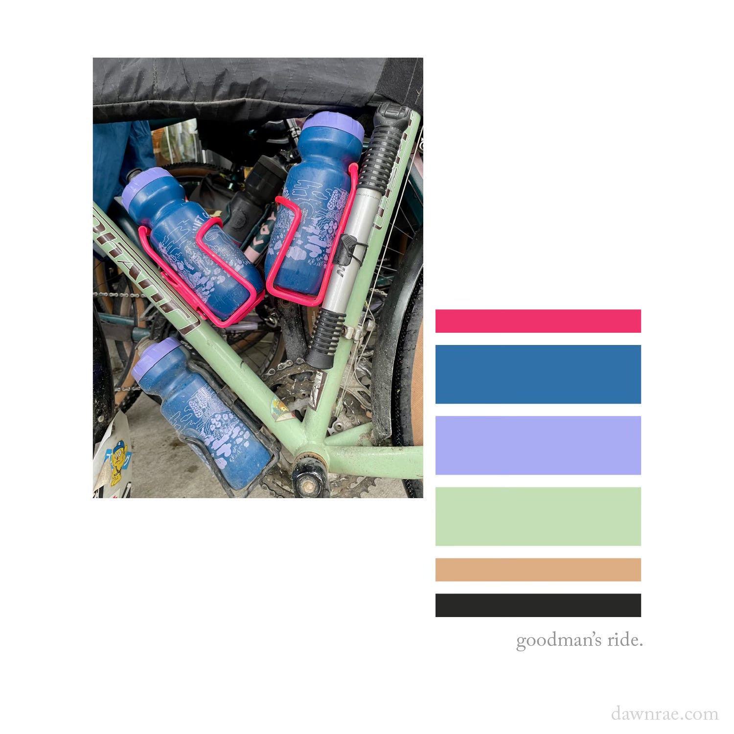
And, here’s a new mini palette from the Swift Campout I went on over the solstice.
For years, Swift Industries has been inviting people all over the world to celebrate the longest day of the year by going bikepacking - solo, with friends, or via an organized community event. This year, I had the joy of going on *the* campout with the lovely Swift crew. I was so happy.
This is Jason’s bike. How great is his color style?
Two last things:
What do you wish you understood better about color? Help me make this newsletter more valuable to you by letting me know. Email me or comment below on what you are currently struggling with (or wondering about).
That vacation? - I’m heading out on a bike adventure through Austria, Italy, Slovenia, and Croatia with my husband and son. If you’re into that sort of thing, I’ll be sharing some occasional posts over on Instagram, @dawnraek.
Take care,
Dawn Rae
Subscribe and share below. I appreciate both!
I help brands understand what their customers will love and value in the future, and I create the color design + trend strategy to get them there.
I design client-specific seasonal trend forecasts, color palettes, and color merchandising plans. Find a full outline of my services here.
If you are curious about working together, reach out: knoth@dawnrae.com.
website: dawnrae.com
socials: LinkedIn Substack
Creative Intelligence: all issues