


That "Quick" Color Project? It's Not That Simple


A few weeks ago, a brand founder reached out with a request:
“I’m reaching out for your expertise as we revitalize our [specific product] with new, vibrant colors.
I’m contacting a few people about this project because it is a quick turn, and simpler than a full color strategy.
The [product] is newly redesigned. When we relaunch it, we want to introduce it in three playful, bright colors that evoke a sense of fun. These new colors should be different from our prior offerings but should ideally complement the three standard colors in our brand palette.
Given the tight timeline, we would appreciate getting your estimate as soon as possible.”
The founder included additional product insight and images. Within a few hours, before I responded, he wrote again to let me know he found someone to help with the project. His communication was kind and considerate, and I’m glad he found what he needed.
But, his request got me thinking.
It’s not abnormal - I am sure many of you can relate to being on the sender or receiver side of this, in a design or other capacity - but it’s not smart.
What’s wrong with it? Three key things stick out to me:
Treating this as a simple project, not real color strategy.
Wanting all new colors for this one new product - one of many in a large line.
A rushed, last-minute timeframe.
How would I change these? Like this:
Every color decision is color strategy.
Color needs to be integrated + cohesive across the entire product line.
Color should never be an afterthought.
Here’s why:
Every Color Decision is Color Strategy
Let’s remember why color is important to a brand. It is the primary characteristic people first notice about a product, and it contributes significantly (75-90%, depending on the study) to whether someone buys a product or not.
Great color strategy has big benefits. It builds brand recognition, increases sales, elevates positioning, tells engaging stories, and strengthens the emotional connection between a brand and its community.
Color strategy is great when it is holistic, intentional, and considered at every color opportunity. It is unlikely that there is one point of time each year or season when you make every color decision for your brand, but every time each year or season or decade when you make a color decision, recognize it for what it is - an integral part of your collective color strategy, a key moment to further establish and elevate your brand’s color identity.
If you view it as less than that, you dilute and fragment the power of color for your brand.
Color Needs to be Integrated + Cohesive
How color is applied across a product line needs to make sense. It needs to make your line easy and exciting to shop and understand. It needs to be recognizable as coming from a singular brand, and - when you really nail color strategy - instantly recognizable as coming from your brand.
One of the key ways that you do this is by creating common color threads throughout the line. Every color in your palette should show up multiple times in your line. The colors in your palette (and thus, in your product line) should all look good together. They need to merchandise. They need to create color stories that produce a pleasing sense of unity and, as a result, a pleasing number of sales.
When you color a style outside of these rules, you orphan it.
Color Should Never Be an Afterthought
I get that not everything goes according to plan and timelines get tight, but if you are designing a product, you know that product is going to need color. It is not going to be invisible when you launch it. So, put color in the product plan from the start, and give it a realistic time frame.
What’s a realistic time frame? One that allows for considered thought, discussion, and revisions. Ideally, sampling too. And, one that plans for and utilizes the expertise of an internal or external, skilled color resource.
When you wait to the last minute, you swap the creative process for an impulse decision. You restrict your color help to resources that are immediately available, and those, my friend, are usually not the experts.
Color is the first thing people notice. Don’t make it the last thing you decide.
So, if you want better color, make sure you’re asking the right questions - What is the strategy? What is the story? What is the plan?
On a different note:
Occasionally in this newsletter, I’ve shared little palettes that I create from passing moments in a day. I call them Mini Palettes from Daily Life. I love this practice, and a big reason why is because of the feedback I’ve gotten from you on how these palettes have sparked your own creativity or changed how you notice color in your everyday.
I’ve recently added a page on my website where you can see them all, along with the stories that inspired them. Here’s the most recent one. Check them all out on the palettes tab of dawnrae.com.
For Spring Break, my family went on a weeklong bikepacking trip in central California. We were looking for warm sun, big days, wildflowers, and fresh new-growth-green everything.
The trip delivered.
Perhaps a little too well in the first half - the temps were much higher than normal and our winter bodies were not adjusted. We were baking, thankful for creek swims and well-timed general stores with ice cream sandwiches.
But by our fourth day, the weather shifted to overcast and 60s; effortlessly ideal.
That day, we rode from Paso Robles up to Parkfield, along quiet rural roads winding through farms and vineyards, past lazy cows and baby sheep. We biked through waves of vibrant green hills and by open fields with gnarled ancient trees and gorgeous heads of salad greens. We crossed the San Andreas Fault.
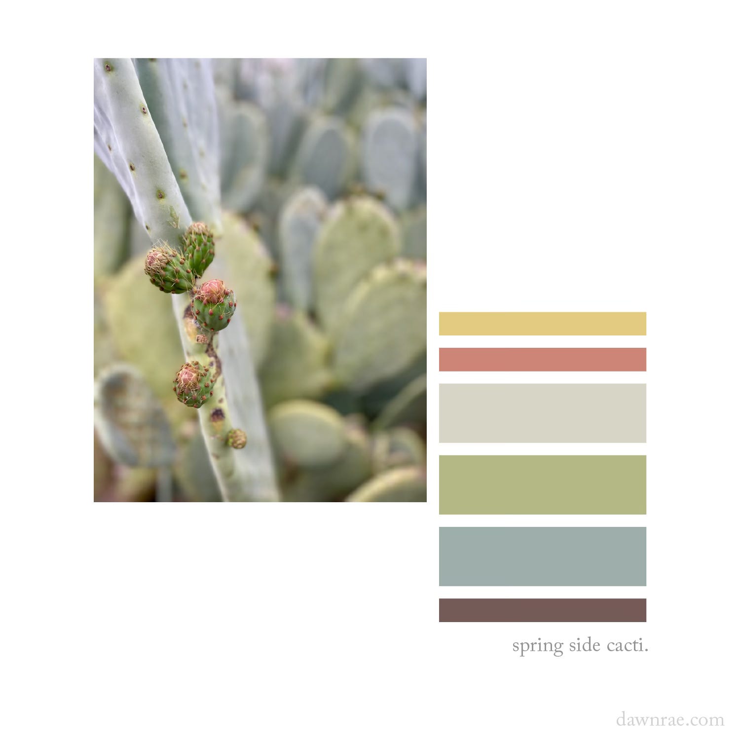
And, we passed by these sweet cacti, an enormous riot of spikes on the side of the road. I had not expected cacti on this trip, yet here they were, and how gorgeous the color!
I shouted, “Stopping to take a picture!” to my hubby and son, and knew, soon, I would turn the photo into a mini palette.
Here it is.
Until next month…
Take care,
Dawn Rae
I help brands understand what their customers will love and value in the future, and I create the color design + trend strategy to get them there.
I design client-specific seasonal trend forecasts, color palettes, and color merchandising plans. Find a full outline of my services here.
If you are curious about working together, reach out: knoth@dawnrae.com.
Subscribe and share below. I so appreciate both.
Connect with me elsewhere:
website: dawnrae.com
socials: LinkedIn Instagram
Creative Intelligence: all issues