
That Color Forecast is Not Your Color Strategy

Creative Intelligence is a free monthly-ish newsletter about the art and business of color — from trend to strategy to design. Thanks for reading!
It’s that time of year again. Brands are kicking off seasonal color design, and trend forecasting companies are releasing their latest color forecasts.
Which is a good time to remember – those key seasonal colors that trend companies are predicting? They are not your new color palette.
Color forecasts capture global movements across industries. They translate broad, macro themes into tangible, precise colors meant to represent and evoke cultural sentiments. They are wonderful at visually capturing the mood of tomorrow and eliciting within us a parallel emotion.
I love them, and I use them.
But (huge BUT here) they are not specific to your brand, its values, personality, or community of customers.
The key seasonal colors that trend forecasting companies predict cover a much larger market, product, and people range. These colors are meant to inspire a lot: tech & electronics, fashion & accessories, home & interiors, sports & outdoor, beauty & wellness, food & drink, transportation & travel, and media & entertainment.
They are meant to be relevant to significant segments of the population. And, they are determined based on macro indicators with far-reaching, global application.
Key colors are also chosen individually, selected to singularly signify a major theme. Meaning, they were not picked to necessarily work together, much less be adopted as a palette.
So, what does that mean for you?
Use these forecasts as inspiration. They are directive, not prescriptive. You have to filter them through your brand’s unique lens.
Look, I get that color is a tricky thing for many people. You just want to know what the right answer is. Reminds me of being a new parent with a kid that didn’t sleep well for months – you just want your pediatrician to tell you the exact thing you have to do and you will do it! Give me the right answer!
But color doesn’t work that way. There is not one right answer. And, there is certainly, CERTAINLY not one right answer for all brands for any one season.
So, this is what you do:
First, understand that everyone has access to these color forecasts. The big trend companies (very generously) make a chunk of their information accessible for free. Your competitors and industry friends look at them too.
I bet that your brand exists because it offers something special. There’s something distinct about your designs and features, about what you do and how you do it. So, don’t kill that by being a me too brand when it comes to color. Use color to mirror your ingenuity. Use color to tell your unique story.
Next, dig into the why behind each of these forecasted colors. Understand what shifts in behavior, mindset, and lifestyle each of them represent. Do these apply to your brand and customers?
No – then, ignore them. Yes – then, how? What specific aspects of these influences overlap with your brand? Would a different color (or tone or shade) capture these same shifts in a way that is much more relevant to you and your customers?
Then, think about your existing color palette and how it needs to evolve for the season. Where are the opportunities for new colors?
Any colors you add this season need to merchandise with your carryover colors, both within your palette and within your product line. New colors also need to be meaningfully different from both existing colors and recently dropped colors. So, when a forecasted color is similar to one you already use (and that forecasted color makes sense for you), 99% of the time, it’s better to stick with what you already have.
Finally, consider your particular market and products. Not all colors (popular or not) make sense for everything or everyone. Refine colors further by thinking about what will translate best for your product materiality, lifespan, and use. Balance what your customers expect and want from you with offering them something that blows their mind a little (in a good way).
Bottom line: Be confident.
Base your color point of view on your unique brand and community. Be limitless in your inspiration, and razor-sharp about what is right for you.
You’ve got this!
Take care,
Dawn Rae
P.S. If you found this valuable, please share, ‘heart’, and spread the word. It means so much to me, and lets me know this matters to you. And, it makes all the hours I spend writing these seem worth it! :)
This month’s Mini Palette from Daily Life:
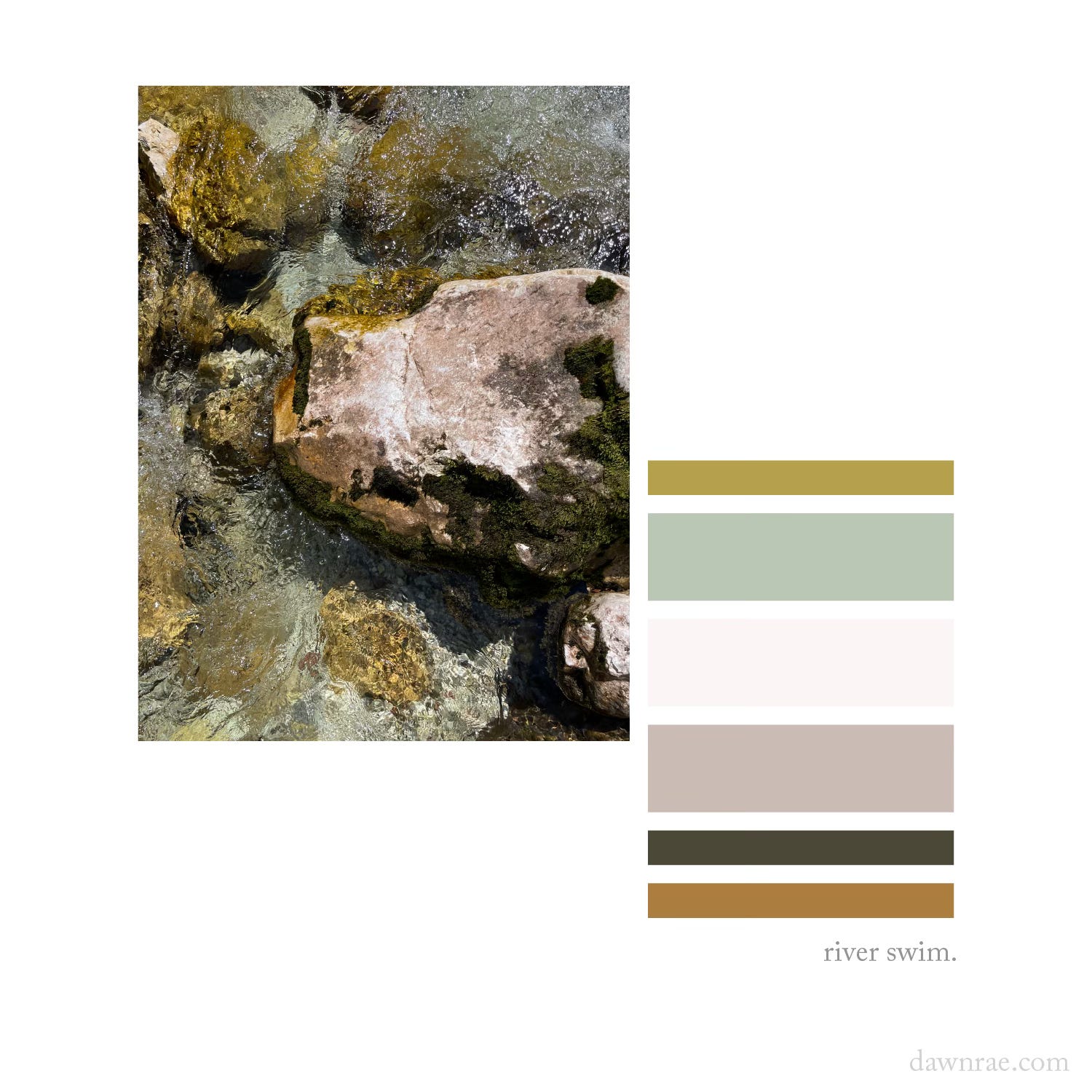
After spending a morning cycling up and over Vršič Pass (Slovenia’s highest mountain pass), my husband, son, and I found a secluded spot by this creek to rest and cool off.
The water was a subtler shade than the nearby Soča’s vivid turquoise, but was much less touristy. And we, as usual, were craving less bustle, more calm, so it was perfect.
I stood on these rocks in the middle of the flow, barefooted, staring at the complexity and beauty of the creek bed’s neutral palette. Gorgeous. Soft.
And, then, I retired to a shady spot along the bank where I lounged in the damp grass, reading another few chapters of The House on the Cerulean Sea.
It was a good day.
I help brands understand what their customers will love and value in the future, and I create the color design + trend strategy to get them there.
I design client-specific seasonal trend forecasts, color palettes, and color merchandising plans. Find a full outline of my services here.
If you are curious about working together, reach out: knoth@dawnrae.com.
website: dawnrae.com
socials: LinkedIn, Instagram, Substack
Creative Intelligence: all issues