How to Pick the Perfect Colors for Your Product
Creative Intelligence is a free monthly-ish newsletter about the art and business of color — from trend to strategy to design. Thank you for reading, responding, sharing, ‘heart’ing, and for helping this newsletter continue by being here. It means so much to me.
You’ve designed a great product and now it’s time to choose the colors it comes in.
How do you decide what those colors are?
By considering these things:
Every color you offer needs to have a job. You created your product for a reason - for a specific purpose, population, and use. Choose color the same way. Every color needs to serve a distinct role in meeting the needs and preferences within your product’s market. Every color needs a job. Color jobs are defined by: color type (core to trend-forward), purpose (mass appeal to niche marketing), lifespan (evergreen to seasonal to limited edition), and target market (geographic, demographic, and/or retailer type).
The colors need to look good together. Collectively, the color assortment needs to grab and hold people’s attention. Attention leads to discovery, and discovery leads to sales. Choose colors that merchandise together and communicate your brand’s personality.
Include a range of color saturations, families, and values. Offering different color saturations (bright to subdued, vivid to neutral), families (blue, green, orange, red…) and values (light to dark) keeps your assortment interesting and ensures that people will be able to find an option that appeals to them. Determine how broad or focused you go in each of these categories based on your product’s market and use.
Choose colors that you can make different (beautiful) sub-palettes from. This allows different retailers and distribution channels to tailor their color buys to their particular niche market, and still harness the overall color vibe and oomph you intended.
Make sure colors are achievable and attractive in product materiality. Do your homework - some materials are difficult to match certain colors in. And, not all colors make sense in all materials. Take material construction, texture, and finish into account when choosing your colors.
Select colors that are relevant for the product investment and lifespan. Give your customers color options that make sense for the commitment they are making with your product.
Build on your existing color strategy, identity, and success. Amplify what is already working for you, and continue to elevate what you are known and loved for. Make sure colors for your product merchandise across your line, especially with products that it will be used with.
Be refreshingly different from your competitors. There’s a reason you invested in bringing this product to life. Use color to honor the unique value it brings to the market.
Be emotive. Color has such a profound effect on how we perceive, experience, and feel about everything, including a product. Tailor your colors to evoke what is meaningful and important to you.
An example:
Let’s see what this might look like in action.
Say, a lifestyle apparel brand is introducing a lightweight women’s chore coat. The brand emphasizes ethical production, high-quality construction, and beautiful, timeless basics. The coat will be made in organic cotton canvas and come in 6 colors.
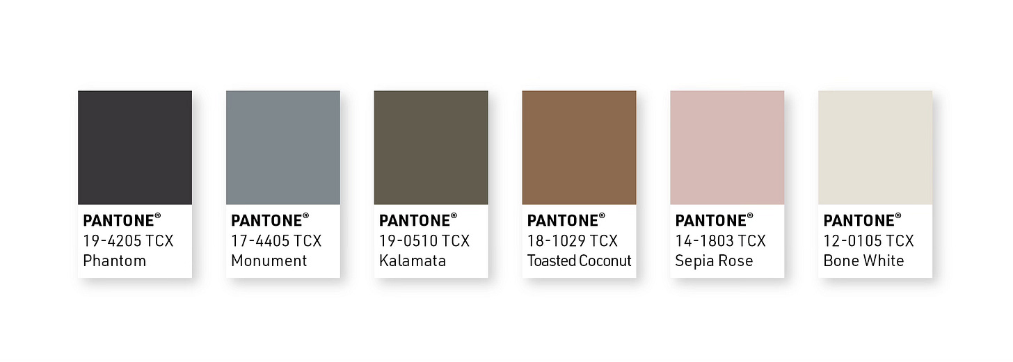
A perfect color assortment could look like this:
Why does this work?
Individually, every single color is appealing and satifies a unique job. Collectively, the colors look beautiful. There are options for basic to statement colors, and each color is tailored to a different demographic, as well as look and style preference.
There is a mix of core colors (Phantom & Kalamata) that could remain in the line for years, as well as long-term colors (Monument & Toasted Coconut) that will be relevant for several seasons. And, there are seasonal, trend-forward colors (Sepia Rose & Bone White).
These colors also make sense for the product type. They merchandise with a range of colors, especially those in fall fashion, making each of them appropriate for a versatile wardrobe piece. And, the colors will translate gorgeously on the canvas material.
The assortment has a range of color families (black, blue gray, green, brown, pink, & white) and values (dark to mid-tone to light). There is not a lot of saturation variation between the colors; however, given the brand ethos and the product materiality, these soft, more subdued hues actually make perfect sense.
In fact, these colors amplify the brand values - they visually communicate sustainability, sophistication, and enduring beauty.
The colors tell a story, and that story supports the core principles of the brand.
I hope this example and these tips help you with your color decisions for your product.
Because once you’ve poured the time, energy, and resources into creating a product, you want to make sure it’s a success.
Getting color right is crucial to ensure people notice it, connect with it, decide to buy it, and, most importantly, fall in love with it.
Take care,
Dawn Rae
Subscribe and share below. I appreciate both!
I help brands understand what their customers will love and value in the future, and I create the color design + trend strategy to get them there.
I design client-specific seasonal trend forecasts, color palettes, and color merchandising plans. Find a full outline of my services here.
If you are curious about working together, reach out: knoth@dawnrae.com.
website: dawnrae.com
socials: LinkedIn Substack
Creative Intelligence: all issues


